![[POSTALYTICS] Quickly Create Customized CSS Stylesheets for Your Clients](https://www.postalytics.com/wp-content/uploads/2023/06/POSTALYTICS-Quickly-Create-Customized-CSS-Stylesheets-for-Your-Clients-1024x536.png)
Design is one of the most integral elements of direct mail.
The colors you add, the fonts you pick, the imagery you include, and the layout you choose all play an essential role in drawing your recipient’s attention and encouraging them to act on your call to action.
As you work with limited space, this becomes all the more important for your direct mail campaigns.
If you’re an agency, you must also take care of the experience you create for your clients, ensuring it matches your agency’s branding. Postalytics provides you with customized CSS stylesheets that help you create this experience.
Let’s first get started with understanding how you can create great designs.
What We’ll Cover:
Direct Mail Design Steps
To create an effective direct mailing design, here are six steps you can follow:
Plan Out Your Direct Mail Piece
Before you start creating designs for your direct mail piece, draw up a rough plan that involves the kind of templates you’re looking to use, the brand guidelines you need to follow for the particular campaign, and references to past designs used for a similar direct mail marketing campaign.
This plan will help your team get inspired and keep everybody pushing in the same direction. For example, if the guidelines dictate what colors should be used for the background, copy, and CTAs, this can reduce a lot of unnecessary editing rounds later on.
Know Your Target Audience
A design that resonates well with IT project managers won’t necessarily work well with social media managers. Knowing your target audience is crucial to getting your design concept right.
You can ask the following questions to find out more about the audience for your campaigns:
- Who are we targeting with this campaign?
- What are their needs? How can we match their needs with our goals?
- Are there specific design rules that work best for them?
- How much information will they need to respond to our offer?
- What kind of CTAs do they most engage with?
If you have sent similar marketing campaigns before to your audience, you can gather the analytics from this campaign. Look at the designs you used, the tone of the copy, and the formats that delivered the best results. This data will give you an idea of your audience’s likes, dislikes, and behavior.
Identify the Goal of Your Piece
What are you trying to achieve with your direct mail campaign?
Do you want to generate more leads for your business?
Do you want to increase sales by sending them exclusive offers?
Do you want to inform customers about a new product or service?
The objective will shape the style of imagery you will use, the colors you include and the kind of copy you write to appeal to that audience.
Having a clear goal at the beginning will also help guide the decisions of the entire team later on.
Choose the Right Format
Your direct mail format will dictate the amount of copy and other design elements you can include. For example, using larger formats (like a brochure), you can include more information about your products or services.
On the other hand, if you just want to send an offer/coupon, a postcard would be the ideal choice.
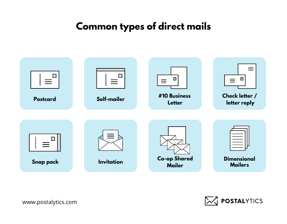
Here are some popular formats you can experiment with:
- Postcards: These are used to announce offers, quick event promotions, or small announcements. It can be a cost-effective way to send relevant information to your target audience.
- Letters: These usually include more information and are typically used to discuss new products/services or upcoming events in detail.
- Brochures/Catalogs: These booklets often hold information about all your products or services. You can even include some offers or special announcements in these direct mailers.
- Self-mailers: These mailers are similar to letters but without an envelope. These are often used for sending special offers, coupons, or newsletters.
- Dimensional mailers: These mailers use 3D elements and pop-ups in the design and are thus the most expensive.
Organize Copy Effectively
You don’t want your copy to get overshadowed by the imagery. Similarly, you don’t want your CTAs overlooked because you didn’t effectively position them in the design.
To avoid these mistakes and ensure your copy is organized effectively, here are some best practices you can follow:
- Have adequate white space with your copy to ensure it doesn’t look cluttered. You can even use it to emphasize certain elements of your copy.
- Place your headline in a prominent place and have it in a larger typeface than the rest of your content.
- Ensure the content length matches the format of your direct mail piece.
- Be clear over clever, and avoid long sentences and complicated words.
- Use a common font style (ideally related to your brand), and avoid using more than two font styles in one mailer.
- Place the CTAs in a prominent place and use engaging text and colors so that it draws the reader’s attention.
Develop a Grid Layout for Your Piece
A grid layout helps you organize every design element so that there’s a proper flow in your direct mail piece, and your recipient doesn’t get confused or tripped over any layout mistake.
But what exactly does a grid layout mean?
A grid layout means using the grids in traditional graph paper to line up your design elements, ensuring correct alignment and spacing.
Below are three layouts you can grapple with.
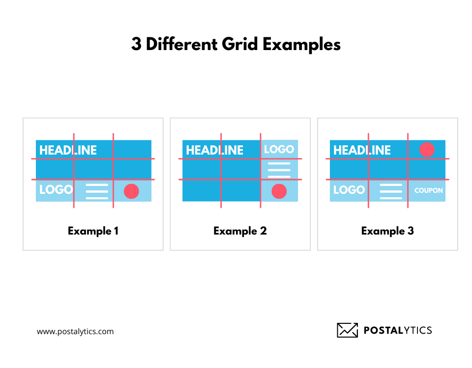
You can lay out your chosen background, copy elements, and logos to ensure everything has the right placement and size. If you are confused between two layouts, opt for A/B testing to nail down the design layout that appeals to your target audience.
Pro-tip: Before picking a layout, ensure it matches USPS regulations or your main postal service regulations to avoid confusion. After all, you don’t want your address panel to get cut out of the direct mail piece because the layout wasn’t proper.
Design Faster and Better
Whether you’re an agency or a business dealing with multiple direct mail campaigns, you can’t afford to spend too much time designing and deploying these campaigns.
Here are three solutions that can help you design faster and better.
Templates Library
You might want to stick to the same grid layout for all your campaigns, or you might want to use the same color tones to create a brand identity.
Instead of starting from scratch every time, your team can save templates that can be reused. For example, if you’re sending retargeting direct mail pieces to different audiences, you can work with the main template and modify some content to target a specific audience.
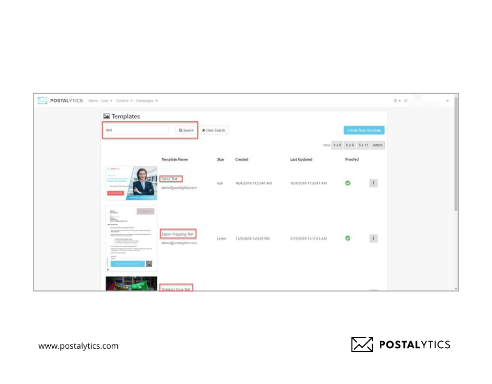
Postalytics offers an inbuilt library where you can save unlimited templates. To access this library, go to the top menu and click ‘Creative’ and then ‘View Templates.’
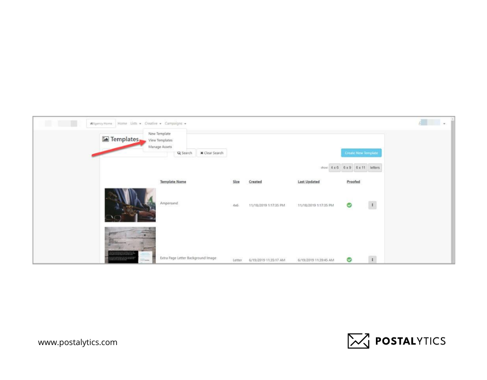
You can even click the Action button beside these templates to edit, copy, proof, or delete them.
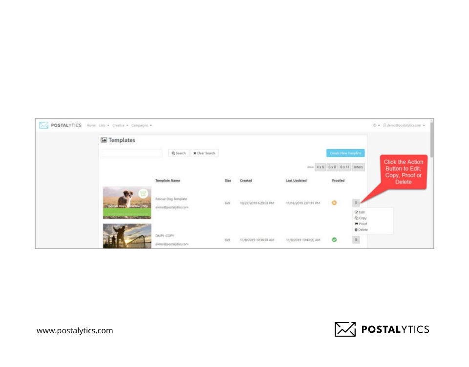
If you have saved a lot of templates, you can use Filters based on the format to find the ones you need. You can even search them by name.
Creative Template Editor
Your team doesn’t have to take a lot of time building designs for campaigns that already have a basic template.
With the Postalytics drag-and-drop template editor, you can easily move things around and create an entirely new design within minutes. You can even use images you created in third-party apps by simply uploading them on the platform.
If you want to personalize your direct mail pieces, you can import your lists from HubSpot or Salesforce and address the pieces by their name or any other relevant data. For example, you can address the person’s and company’s names to make the content more personalized and compelling.
Using the “Variable Logic” function, you can take personalization to another level and have different images or content for different target audiences.
This eliminates the weeks you spend working on one single campaign.
Custom CSS Stylesheets
Isn’t it better to have your entire team or even clients work on one platform for your direct mail campaigns?
To create a customized experience for your clients, you can use CSS stylesheets provided by Postalytics.
To do this, go to the Settings option in the tab, select “Branding” and CSS Stylesheet.
There’s no limit to the file size, and you can create a modified experience. This is especially important for agencies that want to present a branded experience and increase customer engagement and retention.
Best Practices for Creative Direct Mail Design
Below are five best practices you can follow to create great designs:
Set Up a Visual Hierarchy
Instead of using the same font size for all your content headings and subheadings, incorporate visual hierarchy with your design elements. Use a combination of different font sizes, colors, and styles to make your design appealing to your potential customer.
You can create a guide flow, i.e., a flow for how you want your recipients to go through your postcard or letter. For example, you’d want them to see your heading first and then the detailed content, followed by the CTA.
Incorporate this by emphasizing your headings and CTAs in your visual hierarchy.
Use Great Images
The right image can draw your recipient’s attention and make your direct mail piece even more captivating.
Here are three rules you need to remember while selecting imagery for your mailers:
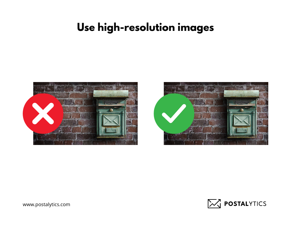
- Pick high-resolution images: High-resolution images of 300 DPI (Dots Per Inch) look professional, crisp, and attractive. Here’s what the difference looks like.
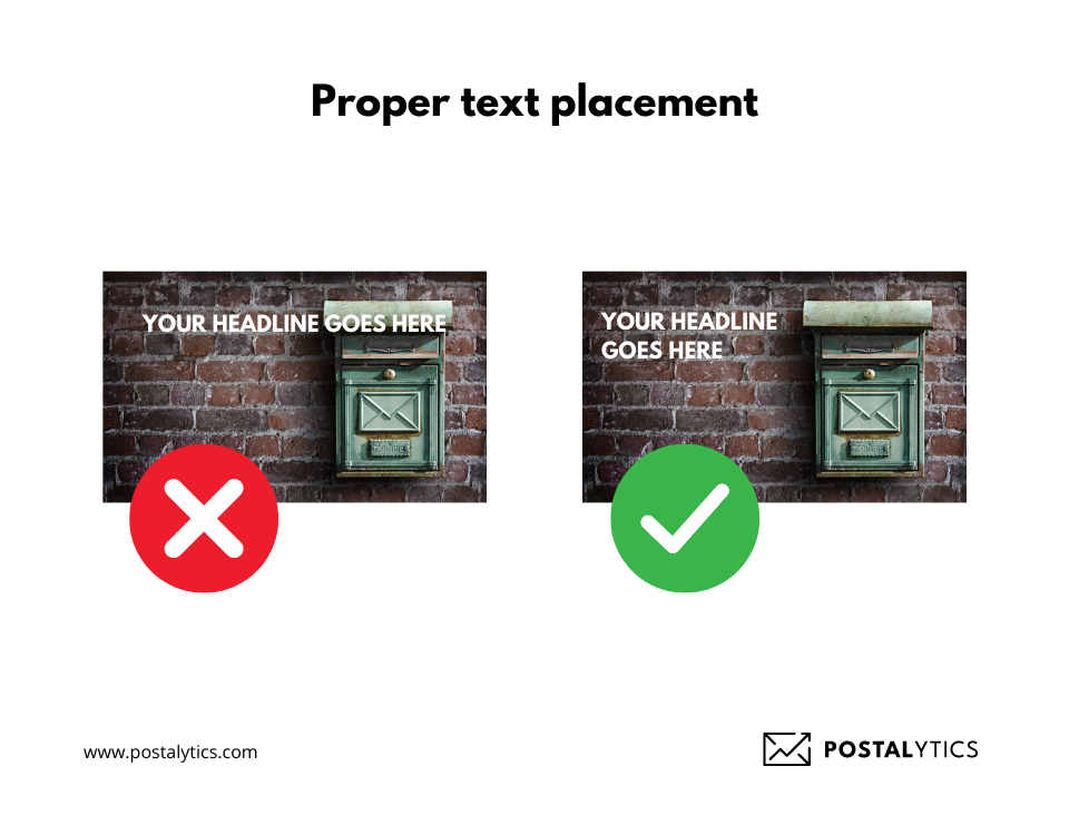
- Don’t crowd your images with text: Placing text over images can make it difficult to read. Instead, either place it over a part of the image that isn’t too crowded or stamp out the part of the image and replace it with a solid color that makes the text stand out.
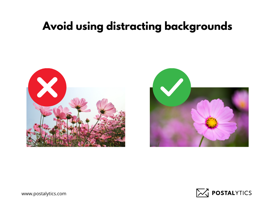
- Avoid using distracting backgrounds: Your background shouldn’t distract the prospects from the main marketing message of your direct mail piece.
Integrate Digital World Icons
People use a lot of digital world icons like emojis, touchpoints and symbols that match words. Your direct mail piece should also include icons like your brand logos, word bubbles, Google Maps-type location pins, and other modern symbols that today’s audience expects.
Using visual language that relates to your audience helps your brand stay relevant and connect better with the recipients.
Get Personal
You must include personalization elements if your ultimate goal is to get more conversions with your direct mail campaigns.
Direct mail platforms like Postalytics allow you to personalize every element of your direct mail campaign, like content, imagery, and CTAs.
For example, you could consider your audience’s past charities and suggest donation amounts according to their history. Or you could show different images based on that person’s current location.
There are many creative ways to enable personalization, and with Postalytics’ “Variable logic” feature, you’ll never run out of ideas.
Make a Strong Call to Action
If your recipient has to spend time figuring out how to take the next step, you’re losing out on conversions.
Your CTA should hold a prominent place that cannot be missed. You could put it in a box, use different colors, or use a larger typeface to make it visible.
You can even bring your audience online using personalized URLs and QR codes. Adding an online element helps you easily track opens, conversions, and the recipient’s online activity.
Final Thoughts
Direct mail can help you reach a wider audience and increase conversions and revenue.
To be effective, you need to pour effort into designing your direct mail piece. There’s a lot to do, be it researching the audience, finding out the kind of personalization they like, or A/B testing two different layouts.
But with direct mail automation platforms like Postalytics, you can design and deploy your campaigns in days instead of weeks. If you’re an agency, you can provide a branded experience to your clients and showcase a cohesive brand image with customized CSS stylesheets.
To find out more about how you can use our platform, get in touch with us today.
About the Author

Dennis Kelly
Dennis Kelly is CEO and co-founder of Postalytics. Dennis joined Boingnet, the predecessor to Postalytics, in 2013. Boingnet was focused on providing print and direct mail marketing service providers the ability to add digital marketing channels to their direct mail campaigns. Postalytics is Dennis’ 6th startup. He has been involved in starting and growing early-stage technology ventures for over 30 years and has held senior management roles at a diverse set of large technology firms including Computer Associates, Palm Inc. and Achieve Healthcare Information Systems.
