When you make direct mail a key part of your overall marketing strategy, it is important that you understand direct mail design best practices in order to maximize your returns. Your audience will interact with your direct mail differently than it does with digital media. 81% of people read or scan their daily mail while only 20% of all emails get opened. Four in ten actively look forward to checking their mail every day. There is a better chance of catching your targets eye and a higher chance of making an impact.
There are more things to take into consideration. Traditionally, designing for direct mail requires more collaboration. Direct mail campaigns were never as easily deployed as digital channels. There are considerations regarding the size of your collateral, DPI and overall quality, and layout to maximize conversions.
That doesn’t have to be the case, though. When you use Postalytics, we make deploying direct mail campaigns as simple as deploying email marketing campaigns. Using our system you can create, deliver, and track your direct mail campaigns just like you would any digital campaign, allowing you to optimize your campaigns over time.
But effective direct mail campaigns start with the best practices. Like any piece of marketing collateral, you need the complete package — a great looking design, effective copywriting, and an enticing offer — to see your maximum return. If you don’t have experience putting together a direct mail campaign, that can be easier said than done.
Let’s dive into some of the top direct mail design best practices that all companies should follow when designing their first campaigns.
Clarity in Message & Design
Like any marketing campaign, direct mail campaigns are only effective when you have a clear message and offer for your targets. If the message isn’t hitting home, it doesn’t matter how pretty your direct mail design in. Your message needs to be poignant but powerful. If you are mailing the right people, your offer should catch their eye and push them toward figuring out how they can qualify.
Direct mail pulls at emotional strings and elicits stronger and more reliable responses than other marketing channels. Inject emotion and appeal to emotions throughout your design and copy to increase conversions for your campaign.

One big mistake that many companies make with their first direct mail design is simply trying to fit too much into too small of a space. Whether you are sending a postcard or different piece of collateral — remember that white space (unfilled space on the collateral) is your friend. Your messages should be short but direct and should provide the recipient with clear instructions.
Keep It Simple
Along the same lines of clarity in message — keep things simple in all aspects of your campaign, including direct mail design and the copy that you have on the collateral as well. Overcrowding your design with images or text can make it hard to read and confusing for your audience. Delivering an offer that requires complicated steps to claim creates another barrier to entry. You want to make sure that any actions that you call your audience to take are as simple to take as possible to increase conversions and maximize your return.
Utilize Both Sides

A piece of direct mail is priced based on the weight of the item. For that reason, you should use all of the space on your collateral that you can, including the back side. It may seem like common sense but if you pay attention to the direct mail that arrives in your mailbox, you’ll probably find that many of the pieces that you receive only use one side.
The back side should include its own design and flesh out the offer that you make on the front. Remember, there is always the chance that they will read the back side first, so you should try to achieve the same level of clarity that you did on the front.
Let the Professionals Handle Design

Another huge mistake that companies make when launching their first direct mail campaigns is not hiring a professional to handle their direct mail design. 60% of millennials expect a consistent experience across channels. Design professionals are able to apply consistent principles across multiple channels, ensuring “message match” and consistent branding.
It’s important that you present a professional appearance in any direct mail campaign that you send. Using an amateur-created direct mail design says something about your company in the recipient’s eyes. A subpar design reflects poorly on your company and will also limit the return that you can expect to receive from your campaign.
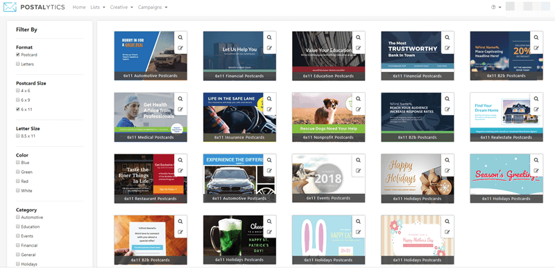
Hire a professional for direct image design. Either that, or find some direct mail templates that you can use for your own campaign. Within Postalytics, we offer dozens of different professionally-designed templates that you can use for your own direct mail campaigns. That will allow you to save money on the design process and will help you to launch your campaigns more quickly.
Call to Action

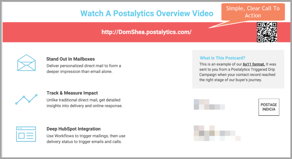
All marketing collateral should include a call to action. A call to action is a piece of text that provides the viewer with instructions on what action they may need to take next. Emails that include a call to action see clicks increase 371% and sales 1617%. An online call to action might say “Click Here Now,” “Buy Now,” “Or “Click Here to Subscribe.” In direct mail design, there are other considerations when it comes to call to actions because the process is usually a bit more complicated.
Postalytics uses personalized URLs (pURLS) to deliver offers and track engagement from those that your campaign was delivered to. Call to actions through our platform might say something like “Visit us at www.MyOffer.com/KevinSmith to Claim Your Free Kit Today.” Make the steps that you want your audience to take after reading the advertisement crystal-clear.
Build Personalization Into Your Direct Mail Design

Personalization plays such a key role in the success of many direct mail campaigns. Being able to speak directly to your recipients and address them by name provides you with a huge leg up over the competition when it comes to connecting with your audience. Build personalization into your design and text wherever possible. Address your recipients by name. Speak to their biggest concerns. Include information about their location if it is relevant. If you have previous interactions with your list, finding ways to reference those can be useful as well.
Stand Out to Increase Your Marketing ROI
Great direct mail design gives you the best chance to stand out from your competitors who are using the same digital marketing techniques. You are fighting with dozens or hundreds of other companies for the attention of the people that you send your offer to. Being able to stand out from much of the competition with high-quality direct mail designs, excellent copy, and personalization throughout your collateral puts you in a position for success.
Postalytics helps companies to design, deliver, and track direct mail campaigns. Want to try your hand at direct mail design? Try our free postcard editor – no login required:
About the Author

Dennis Kelly
Dennis Kelly is CEO and co-founder of Postalytics, the leading direct mail automation platform for marketers to build, deploy and manage direct mail marketing campaigns. Postalytics is Dennis’ 6th startup. He has been involved in starting and growing early-stage technology ventures for over 30 years and has held senior management roles at a diverse set of large technology firms including Computer Associates, Palm Inc. and Achieve Healthcare Information Systems.
