Direct mail often gets the eyeballs and the engagement that digital platforms don’t deliver. But creating effective direct mail pieces doesn’t simply happen. Effective design, a strong call to action, and clear messages are all imperative. Color, too, is critical.
Tomes have been written about color psychology in marketing: the meaning of certain hues, their impact on readers, and, on a technical aspect, how to achieve color consistency on printed pieces. The thing with color is that while preferences are mostly subjective, color has enormous suggestive powers and, as such, is crucial in creating successful direct mail pieces.
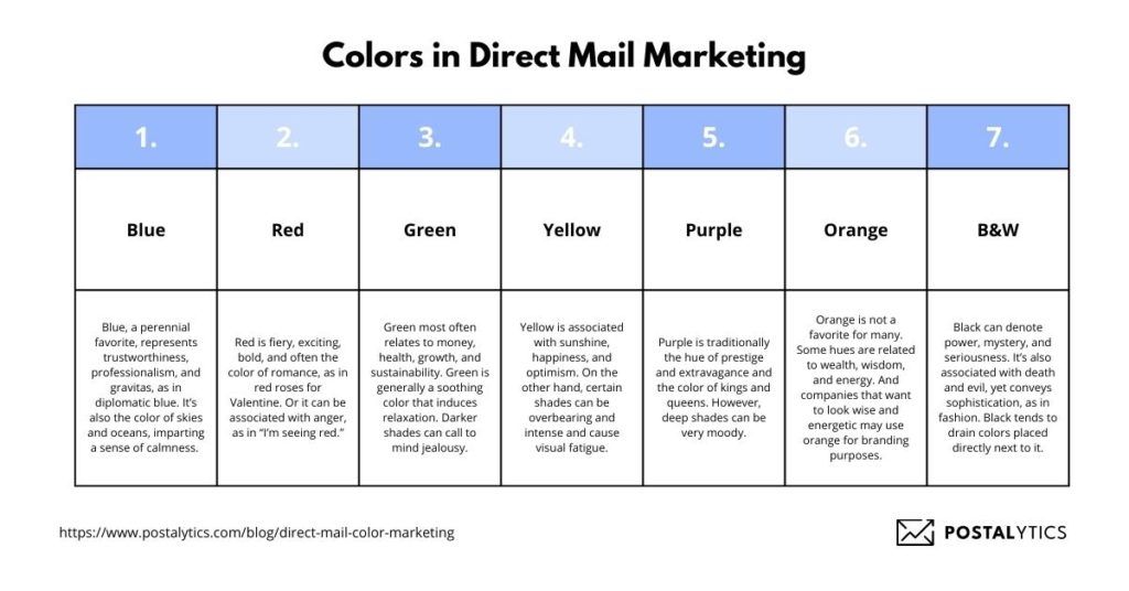
First, a bit about the attributes of some common colors:
Table of contents

Blue
Blue, a perennial favorite, represents trustworthiness, professionalism, and gravitas, as in diplomatic blue. It’s also the color of skies and oceans, imparting a sense of calmness. Some shades, though, can impart sadness. Hence, “I feel blue.”
Red
Red is fiery, exciting, bold, and often the color of romance, as in red roses for Valentine. Or it can be associated with anger, as in “I’m seeing red.”
Green
Green most often relates to money, health, growth, and sustainability. Green is generally a soothing color that induces relaxation. Darker shades can call to mind jealousy or greed, as in “I’m green with envy.”
Yellow
Yellow is associated with sunshine, happiness, and optimism. On the other hand, certain shades can be overbearing and intense and cause visual fatigue.
Purple
Purple is traditionally the hue of prestige and extravagance and the color of kings and queens. However, deep shades can be very moody.
Orange
Orange is not a favorite for many. Some hues are related to wealth, wisdom, and energy. And companies that want to look wise and energetic may use orange for branding purposes. But it’s a very warm color, which can also verge on the side of overbearing.
Black and White
Black can denote power, mystery, and seriousness. It’s also associated with death and evil yet conveys sophistication, as in fashion. Black tends to drain colors placed directly next to it. White represents purity and cleanliness but can also be sterile at times. From a readability viewpoint, a black and white combination is unbeatable.
Other Considerations for Color Ads
While humans associate colors with various emotions and feelings, hues matter too. Vivid and neon shades can overstimulate, while softer versions of similar colors can be calming and less aggressive.
Color association varies with individuals. Colors can elicit certain emotions, but how individuals or groups react to those colors is just as important, and direct mail campaigns need to take this into account. Understanding prospects, their culture, and their interests will play a big role in choosing colors and hues.
Colors can capture the zeitgeist as Millennial Pink did several years ago. This color was perceived as gender neutral, empowering, youthful, non-violent, and somewhat nostalgic, all attributes that resonated with that cohort. Millennial pink was replaced by Gen Z yellow, reflecting the desire for a new culture during a challenging and uncertain era. Colors don’t exist in a vacuum but reflect the economic and political climate.
Uncertain times might call for reassuring warm shades, while optimistic times could suggest vivid hues.
We can tie color to purpose. If direct mail is used to raise brand awareness, then corporate colors are probably best. If a mail piece is part of a large marketing strategy, color should be consistent across the campaign. If the goal is to elicit a certain action, then color should be tied to that goal and to an understanding of what colors prompt prospects to respond.
The printability of colors needs to be considered. You cannot reproduce the vivid gamut of a computer screen on a press, and some colors are difficult to print. A rich, gorgeous black can be challenging to produce, especially on certain types of paper. Consult with a print provider to maximize what’s possible.
The Best Colors for Your Direct Mail Marketing Campaign

As you might have guessed by now, it’s impossible to give you a hard and fast rule about what colors to include in your next direct mail campaign. Anyone who tells you to “always use red!” is being too general. Red isn’t magical any more than the other colors. Different colors work best in different situations.
The nice thing about direct mail is you can easily test your color choices. Use the Postalytics creative platform to copy your templates. Alter only the color among your two test groups and monitor the response. You may find that one color outperforms the other when you direct your mail to your particular audience.
The vast majority of buyers focus on the visual aspect of direct mail pieces. It’s worth the extra effort to be sure you choose the best color for your situation. Start with the general guidelines described above, run some tests (which costs nothing extra with Postalytics since there are no set-up fees), and then settle in with the colors that perform the best.
About the Author

Dennis Kelly
Dennis Kelly is CEO and co-founder of Postalytics. Dennis joined Boingnet, the predecessor to Postalytics, in 2013. Boingnet was focused on providing print and direct mail marketing service providers the ability to add digital marketing channels to their direct mail campaigns. Postalytics is Dennis’ 6th startup. He has been involved in starting and growing early-stage technology ventures for over 30 years and has held senior management roles at a diverse set of large technology firms including Computer Associates, Palm Inc. and Achieve Healthcare Information Systems.
